Tuesday, 16 November 2010

Album Cover by Invisible Creature

I remember checking out the work of Invisible Creature last year and just loving the work they do. Invisible Creature are two brothers based in Seattle who create work in a variety of different media and for a variety of different applications, from clothes to product packaging. Whilst doing some research into album covers, I found this album cover and book art they created for The Foo Fighters. Love it.


Vintage Posters

I stumbled upon these posters for U.S parks from the late 1930's, which utilise really gorgeous use of colour and graphic style illustrations. Get your peepers round these......


Wednesday, 10 November 2010

Animal Posters

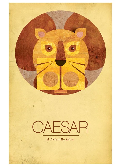
So a few weeks ago when I was doing research into animals for my childrems clothes project, I stumbled upon these posters design by Able,  a Philidelphia based design firm. I really love the simple shapes and textures used and the use of simple typography. Check out some more posters on their site. I would love to be able to make something like this myself......ahhh one day..


Sunday, 7 November 2010

Alan Aldridge

Whilst looking into postmodernism at college, we were asked to do some research into the historical context of an illustrator from either the 60's, 70's or 80's or 90's. Whilst trying t think of illustrators from those periods, I was reminded of an exhibition I saw in London a couple of years ago by Alan Aldridge, so I thought it might be interesting to do some research into him again.


Styles of Design - at the time during the 60's and 70's due to drug culture, there was a resurgence in the swirling patterns of art Nouveau, as it worked well with the idea of psychedelia and hallucinations. There was also a strong use of bright colours that linked to this.

Fashions - There was use of bold colours and patterns again in the 60's and 70's when it came to clothes fashion. There was a lot more freedom with fashion than in post war 50's, and a lot more experimentation.

Music, Films etc. - At the time, and one of the influences on Aldridge's, The Beatles were huge. During the 60's, The Beatles were very influential and their changing style of music captured the changes of the time. In terms of television and film, colour TV was the big thing of the 70's. The influx of colour was a predominant theme during the 60's and 70's. Both TV and film became more imaginative, there was a rise in sitcoms, crime shows and science fiction.  Think Star Trek, The Hulk etc. Because of things like the moon landing in 1969, there was an increased interest in science and the future and this resulted in films like 2001: A Space Odyssey (1968) and A Clockwork Orange (1971).

I've posted some of Aldridge's work below...


Wednesday, 3 November 2010

Olly Moss

I found the work of Olly Moss a while back when looking at different types of posters, and in terms of minimalist film posters, he's definitely got them down. Ive posted a few examples below which I love. He uses iconic elements or scenes from the films to create some really nice visuals. The black and red designs make me think of some of the old penguin book covers, and the orange ones, the Robocop one for instance, reminds me of the work of Noma Bar, an artist I was recently introduced to. He is able to encapsulate the character in as few lines as possible; the side of the gun doubling as the profile of the face. Very cool.

Wednesday, 20 October 2010

Ralph Steadman

Ive recently been reading 'Fear and Loathing in Las Vegas' by Hunter S Thompson, which is illustrated by Ralph Steadman. I didn't think that I liked the style of illustration, but the more I read of the book, the more appropriate they become. His use of energetic line, ink splatters, his mix of free hand and geometric shapes give the illustrations a sense of madness, which is definitely appropriate for the story....


Tuesday, 12 October 2010

Narrative.....in a sewer...

So, another brief that i recently completed was to create a narrative sequence based on or inspired by a given photograph. The photograph I received was of a sewer/tunnel, so I used it to set the tone and location of my narrative.
I definitely found it quite a challenge to come up with a narrative that I thought would be either interesting or funny or had some sort of story to follow and it not be solely about the visuals. So after a little bit of research I thought it would be interesting to go along the lines of some of the myths and legends that have cropped up about sewers and underground tunnels. One of the most famous myths was about alligators living in the New York sewer system, so I came up with the idea of someone hunting this mythical creature, which I thought would make an interesting narrative to follow through, and also give the opportunity for a conclusion at the end, as I definitely wanted it to be a mix of visual and content. 
In terms of working method, this was the first time I had created imagery almost entirely digitally, so it was definitely an experiment! From my final images, I can see a lot of things I would like to improve upon, and at the top of the list is definitely my people drawing skills. I struggle with drawing people and getting them to look "right" (whatever that means!). I think with more time I would have been able to come up with a figure that fit more coherently with the rest of the images. 
Anyway, I've posted them below for you to take a butchers at....
(give 'em a click to make them massive like)
   ><><><><><><><

Friday, 8 October 2010

Make a Product...

So, I've been busy the past couple of weeks working on a couple of different projects, one was a product design brief and the other a narrative brief. Product first then eh....

With only 4 weeks to come up and make a finished product, I made a decision early on to carry on from my summer project, along the lines of animals. Trying to bring a bit of logic into play, I thought that an appropriate product to apply the idea to would be baby/children's clothes, but rather than go in the cutesy/fluffy direction that most babies clothes go, I wanted to create a relatively high-end look (alas I am a poor student!) to the clothes by using some slightly more graphic designs, and employing a neutral and more natural colour scheme to both the clothes and the packaging.

I've posted some photos below of both the baby grows and the packaging I came up with. The animal designs developed and became slightly more sophisticated than what I had done over the summer, and stenciling them by hand meant I could play with different tones of black and grey. I also found the packaging really exciting to look at, and found some inspiration from the packaging website http://www.thedieline.com/ , check it out if you can..and my photos below!


><><><><><><><><>

Sunday, 26 September 2010

Movie Posters

A while back I posted some really cool film posters by Laz Marquez, which I thought were really inspirational. I really love films and over the years have seen some really great poster designs, and as I have recently been given the opportunity to write my own project, I've been doing more research into film posters, as I'd really like to have a go at them myself. I've posted a couple of examples below by Nick Tassone which utilise a minimalist style and a subtle cleverness that I love. I would definitely like to make some as good as these myself. Enjoy....


Tuesday, 7 September 2010

Fortitude Part 3

So, for the final swap for our summer project, I received this photograph which had been worked on by both Rebecca and Megan.

I think working with / adding to a photograph presented a new challenge, and I really didn't know how to approach it begin with. I ended up creating two different images, each incorporating the image in a different way.

I've posted my first image below. I didn't think there was much I could add to the model itself, but saw the white space around it as an opportunity to create something to frame the model. One of the problems I thought about a lot was the fact that anything I added to the photo was never going to blend in, it was always going to be on a different plane and look like a secondary addition. I decided to add some type from the original tapestry in the form of a paper cutting, and also including some pattern from the tapestry. Finally I overlaid the pattern from the mask into the paper cutting to make a connection with the photograph.

The second image I made is below. I was interested in working with the image of a lion myself, so instead of adding to the photograph like I had done previously I wanted to experiment with incorporating the photograph into my own image. I started by drawing out my design and the creating a stencil to try and get a crisp line. I then scanned it in and used the photograph to created the colour in the image. I then added a little bit of type at the bottom to satisfy my type addiction, seriously....