Showing posts with label research. Show all posts

Sunday, 6 May 2012

Big Illustration Party Time Excellent Podcast

It was recommended that we listen to a podcast called Big Illustration Party Time, found here. The podcast is recorded by illustrators Kevin Cross and Joshua Kemble, and consists of them talking about all sort of issues associated with being a freelance illustrator. The particular episode we listened to cover lots of things to do with getting work and self promotion. 

They started off by talking about cold calling art directors. Unless I'm mistaken, they were talking about cold calling AD's to talk to them and see if it was ok to email over work, and they came to the conclusion that sending a cold email was less annoying and probably a better thing to do. I don't think I'd ever considered really phoning someone up just to ask if I could email them my portfolio, but who knows, maybe speaking to them first might actually guarantee a response to your email? On the other hand, we've always been encouraged to try and speak to someone directly when it comes to portfolio visit meetings, which I think makes more sense as its quicker to get a yes or no, and arrange times etc. 

They went on to speak about how to use email as a self promotion tool. Here are some of their tips for sending emails and compiling mailing lists:

  • Compile a list of art directors and send a first email to them all. Any that send you a reply, add to a separate mailing list to send your 'newsletter' to in the future.
  • Email every 3 months - to both 'fans' and prospective employers. 3 months gives you lots of time to come up with lots of new work.
  • Add a ''remove from mailing list' option so they can opt out if they want
  • Try using BCC for the mailing list to avoid spam filters 

It was interesting to here them talk about sending bulk emails via mailing lists, as it something we've kind of been old not to do, as it goes against the idea of personalising your correspondence. I think however that if your doing it in the for of a newsletter, its obviously accepted as standard that these won't be personal. Setting up a newsletter type email is really something to think about, as long as you do a good job, as you can embed links and images into the email so people don't have to waste time downloading and opening separate files.They recommended keeping the content short and sweet, and trying to make it look interesting with nice type etc. They also suggested sending a thank you email after a job is completed is a good thing to do as shows that you appreciated getting the work and are open to more work in the future. In contrast to the Charles Hively podcast, these guys seemed interested in the idea of sending out promo Christmas cards, although they hadn't tried it yet. On one hand, there is something a bit insincere about sending out a card that is also self promotion, but on the other hand, its seems stupid as an illustrator, if you are going to send out a card, that it wouldn't be something you've designed yourself. Maybe this would be best kept for clients you've already worked with rather than prospective clients, because....it's a bit weird anyway to send a stranger a card.

In the next part of the podcast, they spoke about social networking and portfolio sites. This was something I'd recently been involved in a discussion about, so it was interesting to hear what these guys had to say. Here are their suggestions:

  • Spend money making your own site awesome rather than paying for portfolio sites that may not be worth the money
  • Things like Illustration Friday can be good for networking and also building your portfolio quickly
  • Putting work up on sites like Flickr can be good exposure and help increase traffic to your site
  • Using social networking like twitter might not get you work directly, but can get you invites to gallery shows or exhibitions

 I definitely agree that networking and getting your work seen is so important. I'm already on a few social networking sites, but Flickr is something I'm definitely going to look into. Getting your work everywhere will definitely make your life easier and increase your odds of getting work, however I do think its good to edit where you put your work in one sense, and just stick with reputable sites and one with strong illustration communities otherwise its probably just making more work for yourself to update them. I think it's probably trail and error to find the places that work best so I'll hopefully try a few more places in the future and see how it goes. 

Finally, the guys made a point at the end of the podcast about the importance of networking and keeping in contact with other students from your course. I definitely hope to keep in contact with students from my course where possible, and work together in the future. They also recommended getting involved with whatever you can, such as groups or podcasts, and to keep yourself involved and motivated if you want to make a career out of illustration.

 
Overall, the podcast was really helpful and they had lots of good tips and advice that I can use. In contrast to the Charles Hively podcast, their advice seemed to come more from an illustrators perspective, and even contradicted some of the things Hively suggested. I think from this I can draw the conclusion that self promo isn't a science, and some types of promo will go down better with some people than with others, and it might just be a case of giving things a go and seeing how it works out.


><><><><><><><><><><><><><

Podcast: Charles Hively of 3x3

Recently, an interview with Charles Hively (from 3x3) was recommended to us in the form of a podcast on Escape From Illustration Island.

On the podcast, Charles goes through his background and experiences as a designer and illustrator, and goes on to talk about issues such as self promotion for illustrators, and how competitions can be a good way to get your work shown. 

Hively runs 3x3 magazine which is dedicated to contemporary illustration, and has an extensive design career spanning 40 years. On the podcast, he spoke about his background in design and all the different jobs he'd done, leaving us in no doubt he knew what he was talking about. As he is and rt director at the moment, a lot of his advice came from that perspective.

He went on to talk about self promotion for illustrators. What I thought was really interesting about this was that he compared the sort of self promo illustrators do to self promo photographers do. He mentioned that for every 10 emails he gets from photographers, he only gets 1 from an illustrator. I had never really thought about the fact that illustrators aren't the only freelancers sending their work to art directors, and you're almost in competition for their time in that case. Throughout the podcast he recommended that illustrators look at the sort of things that photographers to to promote their work, get work, an how they handle the business/money side of the work as they tend to be a bit more business orientated in his opinion.


Some of the his tips for promotion were:


  • to not email out 1000's of the same email, just focus on people you really want to work with
  • Hand write or personalise your mail to art directors; send them something unique and memorable
  • In your portfolio, don't just pick your favourite piece of work; pick ones that solve a problem or answer the brief the best
  • credit art directors you've worked with as it's a 3rd party endorsement
  • constantly promote yourself, once a month or at least three times a year
  • be prepared to spend some money doing this
  • think with a business mind e.g. take someone to lunch and see it as an investment
  • don't use a Christmas card as self promo

He said that a survey found that illustrators on average spent only $500 (~£315) a year on promo, and that it should be a lot more than that, which is really something I need to think about for the future.


He then went on to talk about websites, and again brought up the standard of photographers sites, and suggested illustrators take some pointers from them. The main points he made were: 


  • that sites should be very easy to access and navigate, without things that take a while to load as art directors generally just don't have the time 
  • don't be shy, list your clients and any awards you have won
  • AD's will look for the weakest piece to know what's the least they can expect from you, and if there's even one really bad piece of work in there, they won't take the risk, so get rid of it

And finally, he spoke a little bit about money, and how illustrators shouldn't be afraid to negotiate for more money. He brought up the amount of money photographer can command, and made the point that as an illustrator you have to do the work of a whole team on a photo shoot. You have to decide the setting, what someones going to look like, the colours etc. and are creating something totally unique, so you shouldn't be afraid to ask a fair price for that.
 He also brought up the point that if we all demanded higher pay, it would raise standards for the industry. This is something I've hard a lot about in the recent months and is really something to think about.

Overall, I thought the podcast was really helpful and informative, and he gave a frank opinion on various matters which has given me a lot to think about, especially in the area of self promotion.

Saturday, 5 May 2012

Thoughtful - Portfolio Visit #9


Last week I went to see Stuart Price from Thoughtful design / Lost In The Forest fame, to show him my portfolio of work and get some feedback.

I hadn't been for a portfolio visit on my own for a while, as the ones in London were more like group ones, so it was nice to get into visiting people on my own again, even if it was just going to the other end of college! Interestingly, I felt a bit more nervous about it as I felt like because we are so close to graduating now, I should be visiting as if I were a professional and not just as a student going through the motions like it kind of was earlier in the year. Anyway, Stuart was really nice to talk to and I didn't feel nervous at all when he was going through my work which was good. He said that he thought the layout out of my folio was good, with the white space around the work. I don't think I've been to a visit yet where any ones had a problem with the layouts, and I think most of the class have used similar layouts, so I think we've all got a handle on that so far.


He seemed really happy with the standard of work I had in there, and asked me how I went about making it etc. He pointed out which he thought were the weaker pieces, e.g. my tram image, so maybe I can replace it in the future when I have new work. He also mentioned there might not be any need for the photos of my album cover in there, especially as I had a hard copy of that with me. I mentioned that I wanted to take out the origami/newsletter piece because I thought it least reflected how I'm working at the moment, but he said that he liked that piece and that it showed a different way of working. Throughout portfolios visits, there seems to have been varying opinions over whether having multiple ways of working in your portfolio is a good or bad thing. Some people have said that it shows that you can be diverse and work in different ways, and other have said that it can confuse clients as to what sort of work they might receive from you. I've kind of come to the conclusion that tailoring your portfolio or having multiple folios depending on who you're showing it might be the way to go, which I had never really thought of doing at the start of the year.

Overall the visit went really well, and Stuart was really positive and encouraging which was great. I'd really love to work with those guys in the future, so I'll try and keep in touch etc. Thanks!


><><><><><><><><><><><


Tuesday, 1 May 2012

Creative Review: Where is the content? - Lawrence Zeegan

This article from a recent edition of Creative Review was recommended to us, and is written by Lawrence Zeegan, who has some interesting views on the state of the illustration industry at the moment, and compares illustration to current/recent London art exhibitions in order to make his point.

Zeegan is an 'educator, illustrator and writer' with over 20 years experience in the industry, so writes authoritatively, however the article seems to be a bit controversial with some people who read it.  
In the article, Zeegan describes illustration as being...

"Obsessed with its own craft, it has withdrawn from society's big debates to focus on the chit-chat of inner sanctum nothingness."

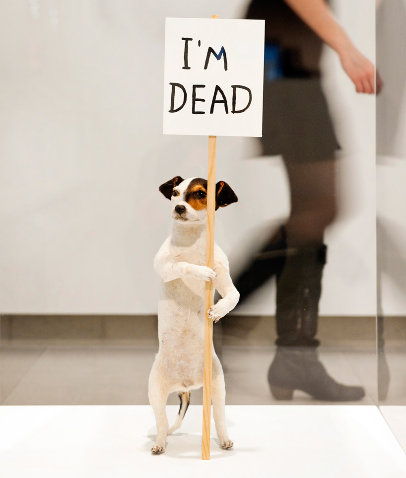
He compares the recent David Shrigley exhibition in London, with the Pick Me Up graphic arts fair across the river, both of which some of us visited when I was down in London. 

He asks the question "Are we offered mere nothingness?" about the work at Pick Me Up. He makes the point throughout the article, about illustration reverting back to a "cottage industry" where illustrators are creating work that is in fashion and looks good, but with no real message or substance, and that the audience they are creating it for is mostly small and comprised of other illustrators. He writes about how illustration should aim to reach a wider audience and should be able to comment on the surround world in the way an 'artist' does. It comes across that he's frustrated that the industry he's, in part, involved in (he is an illustrator after all) is stepping backwards rather than forwards, and not taking the opportunity to really affect change or be used to create strong messages in the way perhaps graphic design does.  

 It seems as though he's just very keen to have illustration come to the fore, whether it be to spread a message or even just for the money. He acknowledges the pull for illustrators to make their own products; zines, prints, clothes etc. in the "make-do-and-mend economy", but asks what will it take for them to take the step to a bigger platform, and maybe being more business minded might be the way to landing bigger commissions in the industry.

To be honest, I thought this article was really interesting and made think about what illustrators could or should aim to achieve. I didn't find any of the things he was writing about particularly controversial myself, it seemed more like he was frustrated with seeing the same sort of superficial work being created in an introverted fashion, rather than seeing powerful illustration being used to spread a message or communicating with a wider audience, which it of course has the potential to do.


Obviously as a student I can't say I have much experience of the industry myself, and there's probably hundreds of illustrators out there making a huge positive change through their work, but I do think it's true that 'artists' or fine artists do get the majority of that limelight, its not often you see an illustrator on the news for a controversial piece of work for example. A lot people don't even know what illustration is when I tell them! Step out of your own world for a bit and you realise most people don't know what sort of work illustrators do a lot of the time.


Throughout the article Zeegan writes most of his comments as questions, suggesting he just wants people to think about the ideas he's talking about, such as style of substance, and questioning why you are creating work and who for. The main thing I got out of the article was to aim high. I think that it is something uni have tried to teach us too, I remember we were told to aim high when trying to get meetings with clients in London, but on the other hand we've also had projects on creating our own products and publications as another way of getting our work out there and making money. So I think aiming for the best of both worlds is probably the way to go....

Check out the article here, and there are also some interesting responses in the comment section too. Peace.


><><><><><><><><><><><
Jill Calder


Illustrator Jill Calder recently paid a visit to college to talk to us about her work and experiences as illustrator. She was really fantastic to listen to and went through a lot of aspects of working as a professional illustrator.

For instance, she spoke about what it was like being represented by an agency (or two) and how that has helped with the business side of things as well as providing interesting projects to work on. She gave really good advice on the money issue, and as most of us leaving uni at the moment probably won't be represented by an agency when starting out, it was good to hear how a working illustrator deals with getting paid. The main point she made was to not let people mess you around with money, and that illustrators are providing a service and deserve to be paid for it, so I think it probably gave us all a bit more confidence when we might have to chase payments in the future.

She also spoke about how it can be a positive to have a more interesting looking portfolio to show prospective clients. She had had a couple hand made in bright colours and decorated to get people's attention. This isn't really something I'd thought about with my portfolio, as I generally didn't think I'd be showing many people a physical portfolio hat often, so mine is just a standard looking one. It could be something to think about in the future, especially if you have to leave it with someone to look at; I suppose a personalised folio could make the work stand out if you're not there to talk about it yourself.


 Jill went on to show u some of her work and how she worked on a project start to finish. She stressed the importance of drawing, and spoke about drawing anywhere, and on anything. Whether it be a sketch book, scrap of paper, or even an ipad, it all has its uses and doing a quick sketch of something when you're out and about, could then help inform or be part of a new piece of work. I though this was really interesting to see, especially as I have done much drawing or sketching from life very recently. My own work is quite precise I suppose and I use a lot of straight lines and grids to make shapes etc., so seeing Jill's sketches actually made me want to do a bit more drawing, and not worry to much about how it looks, as its just another way of gathering information.


She made a couple of suggestions for a good way to work, and these were both 'be silly' and 'be serious'. This made me think of what must be a quote I'd heard someone say once, which was about the best people to work with are people who take their work seriously, but not themselves. And I think that it's similar to what Jill was saying about illustration, which was to take the job seriously and always try and do a good job, but also don't be afraid to have fun and be silly and playful with your work, when appropriate of course. Inject a bit of your own personality and sense of humour into the work, whilst still doing a good, professional job. I thought that was really good advice, because it not only makes the work more interesting to look at, but I suppose it would also make the work more enjoyable and fun to create. I think I could really do with taking this bit of advice on board and being a bit looser and more playful in my work. Although last time I added a sense of humour to my work *cough* mother Teresa card *cough*, people did not get it....oh well!


Over all the lecture was really interesting and funny, I could have listened to her for hours! She made some really good points and gave me some stuff to think about in relation to my own work. And it's always good to her another persons experiences and advice, as it helps answer some questions and give you more confidence in your own ideas. 

And I also have a collection of envelope inside patterns scanned in. Go team. 

Cheers Jill!


Friday, 20 April 2012

London: Pick Me Up


Whilst in London the other week, we went to the Pick Me Up graphic arts fair at Somerset House on the Thames, and this was the first exhibition I'd been to that most of the work seemed to be close to the sort of work we are all looking to produce as illustrators at the moment...if that makes sense. 

There was work on show by lots of different people, some exhibiting as individuals and some as collectives, and a lot of the work was for sale. I saw some great work there, including stuff by Fernando Volken Togni, Matthew Dent, Dominic Owen, Tom Frost and Zim and Zou, and there was also a cool exhibition by the Pick Me Up artists in residence; Peepshow Collective. Their exhibition was titled 'The Museum of Objects and Origins' and featured all sorts of work, from wallpaper and prints on the walls, to objects and textiles in cabinets. Peepshow describe it as...

" Exhibiting items from an invented past, the collection is also a living, growing display as themed workshops create new works to fill the final few cabinets."

I've posted some images below of some of the artist's work, and also Peepshow Collective's exhibition (photo creds to their sites).


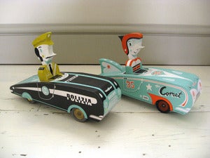
I have to say, some of my favourite pieces of work their were the stamps set by Tom Frost, and looking through some more of his work, I'm definitely a fan, so check out his blog to see what I'm on about, and I've also posted some pieces of his work that weren't at Pick Me Up below,... just because.


Dominic Owen


Tim McDonagh 


Peepshow Collective


Tom Frost's work...


The hand made, screen prinited toy and 3D work of some of the best things I've seen in a while....seriously want one of those cars!


Wednesday, 18 April 2012

Creative Review: The Abyss

We haven't done a creative review session at uni for a while, but I'd thought I'd put up a film recommendation due to it's link with my FMP. Whilst looking into underwater creatures, diving, habitats etc, for my space/underwater project, the film 'The Abyss' is always popping into my mind, particularly when looking into bioluminescent creatures.

The film was released in 1989 and directed by James Cameron, and follows a team of underwater oil drillers as they help search a sunken Navy submarine for survivors. It turns out that they are not the only ones living down their, needless to say excitement and insanity ensues....

Cameron obviously has a huge interest in exploring the oceans, and it's obvious from watching this film. Not only does the story itself explore many areas of interest such as underwater habitats, diving equipment such as underwater rovers, underwater diving technology such as diving suits and liquid breathing, the effects of saturation diving, and underwater creatures etc, but the production of the film itself is incredibly interesting. 

The film was the biggest underwater production of its kind ever, with around 40% of the film being shot underwater. A huge underwater set was created in and old nuclear power station, and the actors had to go through weeks of dive training. Extensive research and development had to be done to create new technology to make shooting possible. For example, the diving suits with full face masks were designed specifically for the film, along with a special radio/sound recording system to capture sound whilst diving.  The film aimed to capture as much real for real footage as possible, with minimal digital effects, model use or stunt cast used. Even the aliens were built and performed by puppeteers!

Seems like an incredible (and expensive) undertaking, and I always find it really interesting to see how much work and effort goes into what you see on screen.

Anyway, check out the making of below if you're interested...


Also, some of the set still exists in the power station, check out some pics below...


Sunday, 8 April 2012

Hayward Gallery - David Shrigley: Brain Activity

(images by linda nylind)

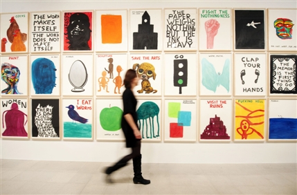
Whilst down in London we went to the David Shrigley exhibition at the Hayward gallery on the south bank. The exhibition was called 'Brain Activity' and was a mix of printed work, sculpture, and animation. It was a really fun exhibition to look round and there were lots of little things that could have easily been missed if you weren't looking carefully. For example their were some tiny little pictures near the floor you had to bend down to see, a peep hole in the wall, and a random stuffed rat just lying on the floor in the corner. 


I think my favourite parts of the exhibition were the prints that were up; one wall consisting of big posters (above) and another two walls of smaller doodles that were really funny observations or pictures of objects with a line of writing to explain them. It was just really interesting to look around and see the different things he'd made, and it had a great sense of humour. Not that often you find yourself laughing in an art gallery.

I've posted a video below of David Shrigley talking about the exhibition, so check it out...


Wednesday, 4 April 2012

Bioluminescence - Edith Widder

I've been looking into bioluminescence of underwater creatures as part of my final major project, and came across this fantastic talk by Edith Widder. There are some incredible creatures down there....


Thursday, 29 March 2012

Serpent's Tail - London : Portfolio Visit #8


Last Friday a group of us went to visit Serpent's Tail publishing down in London. Serpent's Tail is an independent publishing house owned by Profile, and pride themselves on publishing daring and edgy books and, as they put it, 

"voices neglected by the mainstream, and still has a reputation for publishing
the best of all kinds of writing, from literary novels to
crime fiction, from work in translation to books on music and politics."

 When we were there we had a group meeting with Niamh Murray, the marketing director, who talked us through who Serpent's Tail were, what they did, and how they went about commissioning artwork for their books. She had a few examples which she talked us through, and explained how when they pitch cover ideas, its not just to the Serpent's Tail art director, but representatives from the big big shops, amazon and the supermarkets, who all have a say in the choice, based on their own needs. For example, as most books are seen as thumbnails on Amazon, they are usually looking for some bold, readable type, and the supermarkets are looking for a cover that will stand out amongst a lot of books, and appeal to a broad range of people etc.These were all interesting points that I didn't really consider before. She also spoke about how a different cover on the same book can really affect how it sells. I never really considered that the book cover would have such a strong affect on the sales of a book but it seems it really does, so getting the cover right is very important to them.

We then had the opportunity to individually show our work to the art director Peter Dyer. He went through my work quite quickly, and picked out the Stolen Peace album cover as the sort of thing that could work on a book cover. Overall he was pretty positive and mentioned sending through any new work I do that I think might be appropriate for them.

Overall, the visit to Serpent's Tail was really informative and gave me a much better understanding of how a publisher goes about sourcing and choosing work. Everyone there was really nice and seemed to have a genuine passion for finding good work and creating a great book cover.


Charles and Ray Eames: Powers of Ten


Today I had a tutorial for my final major project about space and underwater, and Ian recommended I take a look at this film made by Charles and Ray Eames from 1977, that illustrates the respective size of everything, from the outer reaches of the universe, right down to the proton, zooming in and out by a power of ten every ten seconds. That might sound a bit confusing but give it a watch and you'll understand. Also check out the website The Scale of the Universe 2, which is an updated version of this idea, navigable by scrolling in and out on your mouse.

It's really interesting to watch and see just how big the universe is and how insignificant the proton seems in comparison. In terms of my project it's interesting to see how visually some of the huge space situated imagery; galaxies, planets etc., look quite similar to some of the microscopic cells and atoms, for example, so there are some nice links there between space and underwater creatures/organisms that I can look into more.

Wednesday, 28 March 2012

Silver Screen Society

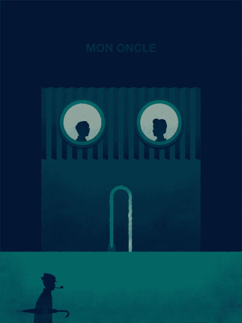
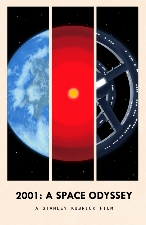
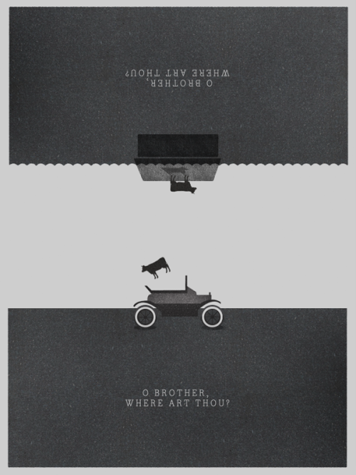
I've been following the Silver Screen Society blog for a while now, so thought I'd do a post about it. The blog is run by Trevor Basset and Brandon Schaefer, and features new work every month by a range of artists/illustrators, all responding to a chosen film. They describe it as taking inspiration from monthly book clubs, but instead picking a new film each month. I love watching films and this is a fantastic way of mixing films with illustration and is something I'd love to have a go at myself when I've got time. Check out the blog here, and I've posted a few cool images from the blog below.....check it out....

"The project’s roots lie in the book clubs of yore, with each month
bringing a new film and a continuous stream of contributors that
carry with
them their own unique interpretations and ideas." - Silver Screen Society


Friday, 9 March 2012

From Student to Designer....

Yesterday, we had a day of talk on the subject of money, and how to make the transition from student to professional designer over the next few months. In the morning, two accountants came in and gave a presentation on how to setup our own business or become self employed, as well as paying taxes and book keeping, and other things like having a good business structure.

Later on, Ian gave a talk on being a freelance illustrator specifically, so this included info on working with art directors, copyright and licensing issues, fees, pro and cons of having an agent, etc.It was really good to get a basic knowledge of some of the stuff we should be aware of when we try and get commissions in the future, and how to deal with some of the legal issues that might arise.

He also spoke a little bit about self promotion and different ways of doing it, with mail outs, emails, phone calls etc., and of course online portfolio's. So on that note, here's mine . It needs some improvement but it'll suffice until I have time to sort it.

Finally, here is a link to an interesting article on pricing from illustrator/typographer Jessica Hische; definitely opens your eyes to the complexities of pricing your work....

Wednesday, 29 February 2012

Book Binding with Lucy Wilson

Last Tuesday, we were all treated to a book binding session with illustrator and book binder Lucy Wilson. It was a really interesting session and fun to learn how to make a book of our own. I'd never really thought much about making my own books or sketchbooks before, but it could definitely be an option for the future. Lucy told us about the advantages of an illustrator being to bind their own books, where to get book binding supplies from, and she had also used her book binding skills to make her own portfolio, which was really cool.

I've posted a couple of pics of the A5 book I made below. I think I probably need a little bit more practice at it as it seems I struggled to even fold my paper properly! But it came out better than I thought and after it was all sewn and glued it actually holds together pretty solidly. Thanks Lucy!


Saturday, 18 February 2012

Mapping the ocean's hidden worlds: Robert Ballard

Posted below is a talk by Robert Ballard on ocean exploration that is really enlightening. For my FMP I'm looking at exploration of both the oceans and space, and I think that I probably considered space exploration to be of more interest or to be less explored than the oceans, but this talk convinced me otherwise. Love his enthusiasm, take a look...


Saturday, 11 February 2012

FMP

So, it's Final Major Project time at uni, which means we have about 16 weeks to work on a self initiated project. The project I have decided to work on is about the extreme environments of in space and under the sea, as they are one one hand the complete opposites, one being close to earth and the other far away; heights and depths, but on the other hand are incredibly similar. They are both vast and hostile environments where humans physically shouldn't be able to travel, and rarely have, as they are still fairly unexplored areas. Because of this, the technology humans have developed to travel and explore both areas is relatively similar; space/diving suits, rockets/submarines, radar/sonar, etc, and because they are relatively investigated, there is also a plethora of myths, legends and theories about what may exist in both. 
So there is loads of interesting options for the project, and I'm not too sure where the project is going at the moment, but it should work out hopefully. We have also been asked to create a small animation as part of our FMP, so I'm really looking forward to getting started on that too, whatever it might be.....
At the moment I'm working on creating some image elements for the project, and below I've posted an attempt at an image that didn't really work out and isn't up to scratch with what I wanted look wise, so I'm working on some new stuff. Learning from my mistakes and all that.....over and out.

Sunday, 5 February 2012

Countdown - Celine Desrumaux

This animation by Celine Desrumaux was recommended to me last summer when I was in the process of researching a space project, and I absolutely love it. It's a short animation about the countdown of a rocket launch, and is a fantastic mix of narrative and slightly abstract images that link back to the technological/mechanical/space flight theme of the film. She has used a huge range of different shots and perspectives, and the mix of narrative imagery and abstract detail images of clocks, computers, logo's, mechanical movements, etc.; work and flow really well. Check it below guys.......


Sunday, 1 January 2012

Nobrow Talk


Whilst at the Leeds Though Bubble festival a few weeks ago, I went to a short talk by Nobrow's Alex Spiro, about how he and Sam Arthur set up Nobrow, and the philosophy of what they wanted to create, and how they found their place in the market.


It was really interesting to hear from a successful publishers that started out only a few years ago in 2008. Their aim was to find a place in the market by publishing bespoke books and print that had high production values and good quality. As it says on their site, they wanted to create "an independent publishing platform for illustration and the graphic arts", and really be a place for new up and coming artists that create good work. 
Alex spoke about how they wanted to find some premises in London that had room for them to have their own print room for screen printing. In the early days, most of the work published was screen printed in small editions and sold via museum shops and small book shops, and that screen printed aesthetic has stayed with them and become synonymous with most Nobrow publications. Alex spoke about how they liked this look, and using spot colour throughout the publications is something that they try to keep going, and in some way can be a deciding factor in the sort of work they publish, but not always. 


   He mentioned that when Nobrow first started, in order to be taken seriously when trying to sell the books and zines, they first spent time building up a small library of 4 or 5 publications to better illustrate what they were about and the sort of work they aimed to publish in the future. They then just walked to shops to try and sell them. It was good to hear that such a successful company started in a very low tech and simple way, by just printing a few books and taking them to different shops and seeing if they were interested.


   Now that they have gotten a bit bigger, they publish through Nobrow Small Press which is still via screen printing in the basement, creating high quality, low runs of print, and through Nobrow Press which is done through offset litho printing which means they can produce many more editions but still at a high quality, and can still try and keep to the spot colour aesthetic if appropriate.  


  When asked how they went about finding people to work with, he said that they did get a lot of submissions through their site, but they mostly find the people themselves via events, degree shows or the web. I think I imagined that they would find most people via submissions, but it was interesting to hear that most people they have found themselves and asked to work with rather than the other way around. Perhaps this is where attending events like D&AD New Blood could pay dividends? But obviously getting any exposure to be seen is the key. 


  Overall it was a really interesting talk, and although I've probably missed out a lot of what was said, I felt like I learnt a lot, and also getting to hear from people behind the names of companies or publishers such as Nobrow, makes things a little bit less scary in terms of possibly contacting people or companies in the future; they are mostly just genuinely nice people who have the same interests as ourselves! Thanks Alex!  


Sunday, 18 December 2011

Music: Portfolio Visit #6

Last week I was lucky enough to be offered an opportunity to go into Music design agency in Manchester to work on a Christmas installation on their glass office. I went in for a meeting and took along my portfolio, which designers Craig and Ed had a look through with me. 


They had obviously seen some of my work on my website before I went in (because of the installation offer) so it was good to hear their thoughts on it face to face. As with other visits, I just went through and explained what each piece was about, and showed them any printed material that I had. They remembered my piece for the 8x8 publication so it was good to show them the full colour printed version of that, and they also liked the astronaut piece I created for my Lunar project, and it wasn't until I mentioned it that Craig noticed the camera reflection in the visor. He suggested that it might be cool to have little twists like that in other work as it makes in interesting and gives in more depth. I definitely like the idea of including little details that aren't obvious at first glance, so this is something to think about in future work, if appropriate. 
This was the second visit I'd been to with my printed childrens book, which I showed to them. Fortunately they were able to see the link between the childrens illustrations and my regular portfolio work, mostly via my use of colour and textures again. They mentioned the fabric texture on the monkey and how it looked like someones jeans, and also that they had seen the illustrations by some other students on the same project at previous portfolio visits.

Overall it was a positive meeting and they didn't really have anything bad to say about my folio. I went away from the meeting to work on my designs for the window installation, which is based on the Christmas 'Grinch Song'. I've posted a sketch for this below, which it should look like more or less when I'm finished. Cheers!

  ><><><><><><><

Illustrations Digital Future

Throughout my time at uni studying illustration, its become more and more apparent that when we graduate, there is a good chance our work or illustrations could be used for digital output, possibly even more so than in print.
With the invention of new technology such as smart phones, ipads, and most people owning computers and using the internet everyday, there seems to be a shift in the ways that illustrations can be created and applied.
Firstly, new software for pcs and macs means that digital illustrations can be created quickly and therefore more cheaply, but they can also be created in the style of more traditional methods. The work of Matthew Lyons for example is created completely digitally with custom brushes and textures to give it a more hand made feel. It makes editing and amendments much easier if working digitally, as well as it already being in a format to send over to a client. Vector illustrations in particular provide greater scope for use as they can be resized bigger or smaller without losing quality.
Although there seems to have been an increase of people going back to handmade methods of creating illustrations by painting, print-making, papercutting etc, these inevitably will have to be scanned in or recreated into a digital format to send to clients in most cases. Email seems to have taken preference over phone calls, and also over sending hard copies in the post, as its just quicker and easier. So even if illustrators work by hand, there would rarely be a time when a computer in some form wouldn't make an appearance during a project. There is a really interesting article here in computer arts about the digital revolution due to software that is worth a look.

In terms of application of illustration, computers and the internet have provided lots of different outlets for work rather than print. Apps, digital magazines (webzines), websites and animations have created more outlets for illustration, whereas the opportunities in print seemed to have decreased, especially in a hard economy.
For example, I recently saw this video about how artist Raghava KK used the ipad to create in interactive children's book  that can be shaken to change up the characters!


There is a list here of children's e-books compiled by The New York Times, that is worth a look. 

There are opportunities in web design too, where illustrators are being used to create interesting artwork, and moving animated artwork for use on websites. I recently saw a piece of work by one of my favourite illustrators, Dan Matutina, where he created and designed a website for Revolver Studios. It required moving elements as well as backgrounds that also have small moving elements to them. (Check out the oil spray and UFO) So i think this is another way that illustrators are being asked to work more like designers, and to apply their skills more broadly across different areas rather just static images. 

The Internet has also provided opportunities for illustrators to show their work and find work. Things like twitter and facebook means that illustrators can network ore easily and get their work shown all over the world. Free portfolio sites that have their own networks such as Behance and Dribbble again provide opportunities to share work, as well as personal websites and blogs of course. So in that respect, I think that the internet can be helpful to illustrators.


Overall I think that illustrations digital future is probably a very rich one and provides many opportunities. Difficulties may arise for illustrators who work more traditionally perhaps, as the amount of print decreases. Also, if illustrators don't have any animation or digital skills on photoshop or illustrator for example, it may be difficult to get jobs when competing with people who can create, animate and design for digital output. Gaining some digital and animation might have to be the way to go for most illustrators,...I guess time will tell.