Thursday, 29 July 2010

Fortitude


So, over the past couple of weeks I've been working on a piece of work for a group project, based on an old tapestry called 'The Triumph of Fortitude'. The tapestry is full of classical and biblical heroes; it's basically the A team of myths and legends, and so the thing that interested me the most were the stories behind each of the characters. 
After doing a bit of research into the characters that could be identified, I started to narrow them down to the characters or stories that I thought had the strongest visual potential, or were easier to encapsulate in just one image. I had a few ideas for different characters, and had I had more time (or managed the time I had better!) I would have like to have done a set of maybe 3 images. 

However, my finished image (shown above) surrounds the story of Eleazar who was crushed to death after stabbing a war elephant in 162BC. I tried to keep the colours neutral and just bring in some textures and pattern in certain areas. I think I could improve it in terms of balance; I think it looks a little bit top heavy, and I think if I had better digital skills I could improve the quality of the scanned elements, but overall I'm happy with the final image.


So, I've posted my image above, as well as a couple of shots of my sketchbook, and more updates will be on their way shortly, enjoy......


><><><><><><><><><><><><><><><

Saturday, 10 July 2010

A Bit of Type.....


I've always loved working with typography, and there are so many fantastic fonts out there for digital use, but I have always felt a bit uncomfortable using them in my work, especially if the type is one of the best parts of the image! 
So, after seeing some fantastic use of type at the D&AD New Blood exhibition, particularly letterpress printed typography, I set to creating some of my own letterpress style type that I can use freely in my own work in the future. But alas, with no press and no blocks, I had to make some of my own stamps for some sample lettering. So after much slicing and dicing, I did some sample prints (which I've posted pics of above) which turned out pretty good. Just another 20 letters to go.........

><><><><><><><><><><><><

Friday, 9 July 2010

A New Project

So, after a few weeks off (and much sleeping), its time to get back to work with a new summer brief from uni. Drawing inspiration from Picasso's reinterpretations of  'Las Meninas' (1656) by Diego Valazquez, we were asked (in groups of 3) to pick a piece of work to reinterpret ourselves. So in collaboration with Rebecca and Megan, we will be reworking a tapestry called 'The Triumph of Fortitude', firstly by ourselves, and then we will exchange what we've done, and work from each others work.

'The Triumph of Fortitude' is a tapestry we found in The Walker Art Gallery in Liverpool. It's full of symbols and fantastic stories and imagery, which meant that hopefully theres a lot we can do with it; many angles to approach it from. So with that in mind, there is much research and sketching to be done! I think it's going to be really interesting to see what we come up with!
I'll post updates on the project over the next few weeks under code name 'Fortitude', but meanwhile, here's a photo of the tapestry for you to get your peepers round, and dont forget to check out the walker art gallery website here for more info, enjoy....


><><><><><><><><><><

Monday, 5 July 2010

Hitchcock Posters

I was recently sent a link to Mr Hudsons blog/website where some really cool Hitchcock film posters had been posted, there was no info about who'd done them, but after a bit of research I found they had been done by Laz Marquez (definitely check out his site), anyway, I thought they were really nice; simply made, referencing that Saul Bass style of some of the original posters, but with a kind of cool twist with the use of paint and ink etc. I particularly like the No Rear Window poster (look at binoculars!....and the colours!....and the type!) and The Birds poster with the little birds coming out of the ink at the top, very cool.....
 

Childrens Book Festival - John Lawrence

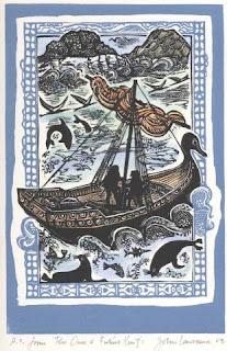
On Saturday, thanks to a tip off from Jo, I was able to catch a talk on the practice of childrens book illustration by illustrator John Lawrence at the Manchester Children's Book Festival. I didn't know about him before hand and just went along on the off chance I could learn something, and I'm so glad I did! He was such a lovely guy and his work was fantastic! These days he primarly works doing vinyl/lino and woodcut prints, and has illustrated loads of books. He spoke about how he gets his inspiration for his illustrations, and how he goes about putting them together; he was a real pleasure to listen to. He showed a lot of his illustrations on the projector, and went through how he made them, and there was also a mini exhibition of some of his work, and a few other illustrators. I could have spent ages just staring at his prints! Anyway, I've included a few examples of his work below, all of which he talked about on Saturday, enjoy......