Thursday 29 March 2012

Serpent's Tail - London : Portfolio Visit #8


Last Friday a group of us went to visit Serpent's Tail publishing down in London. Serpent's Tail is an independent publishing house owned by Profile, and pride themselves on publishing daring and edgy books and, as they put it, 

"voices neglected by the mainstream, and still has a reputation for publishing
the best of all kinds of writing, from literary novels to
crime fiction, from work in translation to books on music and politics."

 When we were there we had a group meeting with Niamh Murray, the marketing director, who talked us through who Serpent's Tail were, what they did, and how they went about commissioning artwork for their books. She had a few examples which she talked us through, and explained how when they pitch cover ideas, its not just to the Serpent's Tail art director, but representatives from the big big shops, amazon and the supermarkets, who all have a say in the choice, based on their own needs. For example, as most books are seen as thumbnails on Amazon, they are usually looking for some bold, readable type, and the supermarkets are looking for a cover that will stand out amongst a lot of books, and appeal to a broad range of people etc.These were all interesting points that I didn't really consider before. She also spoke about how a different cover on the same book can really affect how it sells. I never really considered that the book cover would have such a strong affect on the sales of a book but it seems it really does, so getting the cover right is very important to them.

We then had the opportunity to individually show our work to the art director Peter Dyer. He went through my work quite quickly, and picked out the Stolen Peace album cover as the sort of thing that could work on a book cover. Overall he was pretty positive and mentioned sending through any new work I do that I think might be appropriate for them.

Overall, the visit to Serpent's Tail was really informative and gave me a much better understanding of how a publisher goes about sourcing and choosing work. Everyone there was really nice and seemed to have a genuine passion for finding good work and creating a great book cover.


Charles and Ray Eames: Powers of Ten


Today I had a tutorial for my final major project about space and underwater, and Ian recommended I take a look at this film made by Charles and Ray Eames from 1977, that illustrates the respective size of everything, from the outer reaches of the universe, right down to the proton, zooming in and out by a power of ten every ten seconds. That might sound a bit confusing but give it a watch and you'll understand. Also check out the website The Scale of the Universe 2, which is an updated version of this idea, navigable by scrolling in and out on your mouse.

It's really interesting to watch and see just how big the universe is and how insignificant the proton seems in comparison. In terms of my project it's interesting to see how visually some of the huge space situated imagery; galaxies, planets etc., look quite similar to some of the microscopic cells and atoms, for example, so there are some nice links there between space and underwater creatures/organisms that I can look into more.

Nobrow - London: Portfolio Visit #7

Illustration by Luke Pearson, from site here

Last week we went on a uni trip down to London for a couple of days, so we had the opportunity to meet with people in the industry to get some feedback on our portfolio's. Four of us took the opportunity to go and visit Nobrow at their shop in Shoreditch, where Sam Arthur spared some time to have a look at our work. Nobrow are renowned for their high quality self published books and magazines, more often than not featuring work by illustrators, both well established and new up and coming talent, and also sell a range of prints, tshirts, toys, etc.


When looking through my folio he mentioned which pieces he thought worked better than others, such as my 8x8 dinosaur-man piece, and ones that didn't work as well. He stressed to all of us the importance of having some consistency in your portfolio as it gives whoever's looking at your work a strong idea of what they will be getting if they hire you. He also mentioned to us all, that if we're showing our work to print-based art directors, to maybe not including installation or photographed 3D work as its not something they would be looking for. Perhaps tailoring your portfolio to who you will be showing it too is a good idea, which isn't really something I'd thought about before.

Another point he made was that it doesn't really matter how many pieces of work you have in your portfolio, and that it might be better to have fewer really good pieces of work that you love, rather than more pieces of varying quality.

Overall he gave us some good advice and some things for us to think about when we are trying to get work in the future, so it was a valuable visit! Thanks Sam!

Wednesday 28 March 2012

Silver Screen Society

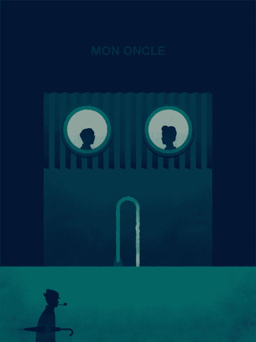
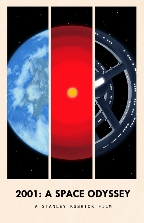
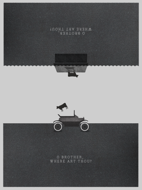
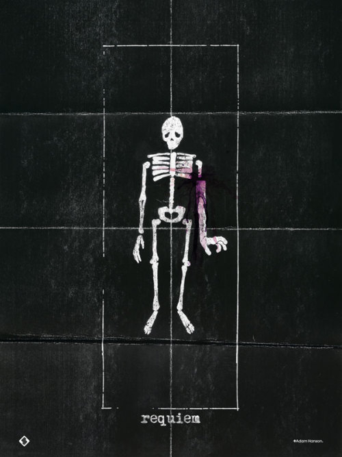
I've been following the Silver Screen Society blog for a while now, so thought I'd do a post about it. The blog is run by Trevor Basset and Brandon Schaefer, and features new work every month by a range of artists/illustrators, all responding to a chosen film. They describe it as taking inspiration from monthly book clubs, but instead picking a new film each month. I love watching films and this is a fantastic way of mixing films with illustration and is something I'd love to have a go at myself when I've got time. Check out the blog here, and I've posted a few cool images from the blog below.....check it out....

"The project’s roots lie in the book clubs of yore, with each month
bringing a new film and a continuous stream of contributors that
carry with
them their own unique interpretations and ideas." - Silver Screen Society


Monday 12 March 2012

UFO

For my FMP I'm looking at underwater and space exploration and the similarities between both, so I've started to look at mixing visual elements from both environments into more complex hybrids than just collaging images together. Attempt number one....weird UFO jellyfish....


Friday 9 March 2012

From Student to Designer....

Yesterday, we had a day of talk on the subject of money, and how to make the transition from student to professional designer over the next few months. In the morning, two accountants came in and gave a presentation on how to setup our own business or become self employed, as well as paying taxes and book keeping, and other things like having a good business structure.

Later on, Ian gave a talk on being a freelance illustrator specifically, so this included info on working with art directors, copyright and licensing issues, fees, pro and cons of having an agent, etc.It was really good to get a basic knowledge of some of the stuff we should be aware of when we try and get commissions in the future, and how to deal with some of the legal issues that might arise.

He also spoke a little bit about self promotion and different ways of doing it, with mail outs, emails, phone calls etc., and of course online portfolio's. So on that note, here's mine . It needs some improvement but it'll suffice until I have time to sort it.

Finally, here is a link to an interesting article on pricing from illustrator/typographer Jessica Hische; definitely opens your eyes to the complexities of pricing your work....