Tuesday, 29 November 2011

Creative Review : Book


The book I recommended at the first creative review was 'Do Androids Dream of Electric Sheep?' by Philip K Dick. I'm doing my dissertation on the film Blade Runner, and this is the book that it's based on. I'd actually read this book a while ago before I'd seen the film, and decided to start reading it again recently.

The book is a sci-fi novel set in San Fransisco in the year 2021, and follows Rick Deckard, a police officer who's job it is to 'retire' androids. The book is a lot broader in detail than the film in terms of subjects and the different issues it tackles, but still follows the main issue of humanity. With out going into loads of detail about everything that happens in the book, I'd say its definitely worth a read as like the film, it presents an imaginative but not unrealistic future vision, extrapolating the present, and issues such as war, religion and technology are discussed via an interesting and exciting detective story. Good times.

It also contains one of the best words ever : Kipple.

" JR - Kipple is useless objects, like junk mail or match folders after
you use the last match or gum wrappers of yesterday's homeopape. 
When nobody's around, kipple reproduces itself. For instance, if you go to 
bed leaving any kipple around your apartment, when you wake up the 
next morning there's twice as much of it. It always gets more and more.

Pris- I see. 

JR - There's the First Law of Kipple, "Kipple drives out nonkipple." Like Gresham's 
law about bad money. And in these apartments there's been nobody 
there to fight the kipple. 

Pris - So it has taken over completely. Now I understand. 

JR - Your place, here, this apartment you've picked - it's too kipple-ized to live in. 
We can roll the kipple-factor back; we can do like I said, raid the other apartments. But - 

Pris - But what? 

JR - We can't win. 

Pris - Why not? 

JR - No one can win against kipple, except temporarily and maybe in one spot, like
in my apartment I've sort of created a stasis between the pressure of 
kipple and nonkipple, for the time being. But eventually I'll die or go away, and then 
the kipple will again take over. It's a universal principle operating throughout the 
universe; the entire universe is moving toward a final state of total, absolute kippleization. "

Thought Bubble : Leeds Comic Con

On the 19th of November, I went up to Leeds to the Thought Bubble Festival. Thought Bubble is a convention "dedicated to promoting comics, graphic novels, and animation as an important national and international cultural art-form.", and ran over a few days throughout the week at venues throughout Leeds and Bradford, and then there was the main convention and events over the weekend. 

Although I know nothing about comics, I thought it would be interesting to go as they had loads of people and companies/collectives there selling work, as well as some interesting talks scheduled. The main convention was held at The Armouries, a complex of shops and casinos as well as the armouries museum. When I got there, there was a huge queue for tickets, and lots of people in costumes which was really cool to see. There were a few stormtroopers, a batman and judge dredd.

I'll post about some of the talks I went to in separate posts, but for now I just wanted to mention the huge hall of stalls run by various companies, collectives and individuals, all selling there own publications, posters, prints and a whole load of other cool stuff.

Apologies for the not so great pics.....


I have to say that I wasn't familiar with many of the people or groups there (as again I know nothing about comics!) but there was loads of great stuff to see and buy. There were a couple of them that I recognised, such as Nobrow and Luke Pearson, but I've scanned in the list for the main hall anyway and you can take a look and see if there's anyone you might know....(give it a click to make it big time)


Overall it was a good event to go to with lots of interesting stuff to see. I'll post about some of the talks in separate posts so as not to overwhelm you with comic/illustration goodness...

><><><><><><><><><><><><


Monday, 28 November 2011

D&AD Education Day: Wash Portfolio Visit

Back to Preston again! After I'd spoken James from Dorothy at the portfolio session, I had a bit of spare time whilst waiting for others to finish their visits, so I went back to see if there was any chance of speaking to somebody else about my portfolio.
 
Fortunately there was still an open spot, and I was able to speak to Andy Walmsley of Wash Design, a Preston based studio. He was, once again, a really nice guy to talk to, and actually went through my portfolio pretty quickly without me explaining anything to begin with, as he said he wanted to have a look through and then he'd go back and talk to me about the work. 
First of all, he really liked the presentation of the portfolio and the little explanations and titles at the bottom of each page (thanks Ian!). He also said that he was quite pleased at the range of work I had in there as he went from page to page, as it seemed spread over a few different areas (editorial, poster, etc.). This is again something I've found everyone seems to consider a positive attribute in a portfolio. And again, he seemed to appreciate seeing things in print which I'd taken with me; the Stolen Peace Album cover for example.

He seemed to like the work I had in there, in particular the origami/transformation newsletter image. As this is one of my least favourite images in my portfolio, I'm always surprised when people like it! I think it's definitely more of a concept based piece, but he like the geometric design and compared it to a kind of Metropolis, art deco type design. I do love art deco so I think that was a nice comparison to hear, but I can't say I consciously was aiming for that look, maybe it's evident just through the balanced, graphic nature of the image anyway...

He thought that the weakest image I had was perhaps my MASI tram image, because of the windows. This is something I've actually been waiting for someone to mention, as they are the only bit of that image I'm not really happy with. Due to the deadline I just wasn't able to work on them as much as I'd like and so they look a bit flat and boring. He said they probably didn't need the slight flare on them as it clashes with the blockyness of the rest of the image. I do agree with him on this, and it does grate a bit using what I guess are stock effects in photoshop, I think I was really just trying to sell it being a window. I think I could definitely improve this somehow, maybe adding more detail and working on the through and through aspect of the tram. I also used a flare on my astronaut piece, but I think it worked ok on there because it was a bright light reflection, might try out a custom reflection of some sort on there though...I'm not sure...


Overall it was a really positive viewing, and he really seemed interested in my work. He gave me a card and told me to send work through to him throughout the year when I do anything new and he'd be happy to take a look at it and see how it progresses. This was really generous of him and positive for me as I guess he saw some potential in my work (or that's what I'm telling myself!). Cool. Thanks Andy!

Saturday, 26 November 2011

'Red' by Oneedo


Ned Wenlock aka Oneedo created this animation music video for Jet Jaguar, which involves minimalist insects and flowers interacting. Ned describes on his vimeo page,-

"I was going through a minimal phase at the time and approached this as a digital nature documentary. I was interested in finding simple, graphic ways to animate insects, my favourite here being the light flys."

The simple designs of the elements are really cool, and remind of the work of Charley Harper; very flat and geometric. 

As I'm working on a short insect animation collaboration at the moment that is kind of in a similar 'flat' manner, its interesting to see how other people have animated insects, use of movement, shot choices etc. as well as how the visuals and music work together.

The more abstract use of flashing lights and strips of colour along with the electronic music is dichotomous with the images of nature and insects, but it works together really well and a great choice which makes it more visually interesting. It doesn't have to be realistic to make sense. Cool!


Friday, 25 November 2011

D&AD Education Day : Dorothy Portfolio Visit

At the D&AD education day last Wednesday, they held a 'Portfolio Surgery' where we could take our portfolios to be looked at by various industry professionals from different design agencies. 
We were all allocated a 20 min visit with a professional, and my visit was with Manchester based design agency Dorothy (there was some confusion over whether this was the name of the person or the company, but I can confirm the chap I spoke to was not a Dorothy). He was in fact James Quail, and was really nice to speak to.
As we went through my portfolio I told him a bit about each piece of work, and he was very positive about it. As we came to the last piece he said he was actually disappointed that it was the end as he would have like to have seen more, which was really nice, but probably also means that I could do with maybe a few more pieces in there, as I've only got about 8 in at the moment. Hopefully I'll be able to create a couple more decent bits of work to put in there. 
He liked the variation of different ways I'd applied work, i.e. books covers, editorial, posters, etc. It seems people like to see a bit of diversity so that they can see how your work could work in various settings, and again he commented on how its good to see things in context, so either in print, or dropped into some sort of layout in your portfolio. I'd definitely recommend that to everyone.
Overall he seemed really positive about the work and thought it was a strong portfolio. I asked him about the different ways that they find illustrators at Dorothy, and he mentioned looking at different blogs (I know I follow a few that show great work) and I talked to him about how submitting work to blogs can be a great way to get exposure. 
He also said that having a web presence for your work is a must. So making a site is definitely important, and places like Cargo are popular for that, or even a portfolio site like Behance or even Flickr is better than nothing.

So, it was a good portfolio visit, but I think a few more pieces of work would improve my folio a bit, and I also need to think of better questions to ask next time! I go completely blank!

Thursday, 24 November 2011

Creative Review : Exhibition

Back to the first 'creative review', with an exhibition. This isn't an exhibition that I've been to, but one that I think would be really interesting to go see if I were in London. It is a Postmodernism exhibition that is currently running at the V&A on London, entitled...  
'Postmodernism: Style and Subversion 1970-1990'

You can check out what the exhibition is about here at the V&A website, but I'll explain why I think it would be good to go see anyway.

I'm doing my dissertation on postmodernism and the film 'Blade Runner', and when it comes to trying to form some sort of definition of what postmodernism is or refers to, the more you read; the more difficult it becomes (to me anyway!). Ideas about postmodernism span many different facets from art, film and fashion, to architecture, philosophy, sociology and psychology, but when its comes to visual postmodernism (e.g art, design and architecture) I think that being able to go to an exhibition and surround yourself with examples that are considered postmodern, I think would be really helpful in understanding it. 


The V&A explains...'Postmodernism shattered established ideas about style. It brought a radical freedom to art and design, through gestures that were often funny, sometimes confrontational and occasionally absurd. Most of all, postmodernism brought a new self-awareness about style itself.'


 From the description of the exhibiti[_m jP9Gʪ0 Boz dd*!'ve posted online I think this would be a really interesting exhibition to go to.

D&AD Education Day : Jack Renwick


Designer and art director Jack Renwick also spoke at the morning lecture at D&AD last Wednesday. Originally from Scotland, she moved to London to work with established design and branding agency The Partners (who have both an office in London and New York), and had been with them for a good few years until recently when she decided to venture out on her own. Jack is also a D&AD judge, and has won a few awards herself, both as a student and for her work at The Partners.

Jack firstly spoke about how she got into the industry, through ramp welding and sign making, and went on to talk about the work she had done at The Partners.

For example, they were asked to design the packaging for 'Mr Singh's Bangras', Indian flavoured sausages. They decided to not only create the box packaging, but also to design the package and look of each individual sausage by printing onto the skin in edible inks, such as the henna style pattern on the sausage below.

I really loved this idea as it just seemed to have taken the idea of packaging to another level, and they had really gone that extra mile to create something unique and special. They could have just made a nice box or packet but they really though about how to create something really appealing and created a great selling point.

Another project I was really impressed by was one that they had done for Deloitte (a huge accountancy firm with more than 165,000 employees all over the world). The brief was to create a fancy screen saver for all of Deloitte's computers, but as screen savers aren't really needed anymore, they created an eco friendly application that shuts down the computers to save loads of money and more importantly, energy. I think this is an example of really thinking outside of the box, and not just how to answer the given brief, but to answer the problem behind the brief in a better and more efficient way. I've posted a little vid from their website below which explains the idea, check it out.......


She spoke about a few other projects to that involved making logos, packaging design and typography. She also gave a few bits of advice about working in the industry, including learning to love the client, working hard, having a good personality, and how it can be really good to work as part of a team. 

I really enjoyed Jack's talk as she was really honest and down to earth, and some of the ideas she presented for projects were just really imaginative, and things I would never have thought of! I'll definitely keep an eye out for her work in the future....


D&AD Education Day : Preston

(photo courtesy of Steve Wilkin)
Last Wednesday a group of us from uni attended the D&AD Education day at UCLAN in Preston. The day was set up as a chance for students to go and learn about D&AD and to get advice about the upcoming competitions, as well as an opportunity to get involved in some workshops and to meet people that worked in the creative industry.
We attended the morning lecture, where Rhiannon James (Education Director) from D&AD spoke about the history of D&AD, as well as how to approach the student competitions and how it was judged, as well as showing some work that had won awards at D&AD. 


She firstly spoke about the history D&AD and how it was set up in 1962 by a group of designers including Alan Fletcher, David Bailey and Terence Donavon, as a charity aiming to look for the best in design, and to reward those responsible. It's ran as a charity, as all the money they receive they try and give back to the designers by providing monetary prizes, and funding workshops, education days and providing links with industry to both graduates and students. 


Then she talked a bit about the D&AD awards and gave examples of some of the winners and the reasons that they had won. 

There's the yellow pencil award for - 'Work that is outstanding, rather than merely brilliant...'

and the black pencil award for - 'The best of the best, the ultimate award, for work that is truly groundbreaking.'

They have also introduced the new white pencil award introduced this year which is -  'awarded to a creative idea that changes the world for the better; an idea that demonstrates the ability to influence real and positive change in the world.'

She also spoke about how entries are judged, and showed a video of various professionals describing what they look for in a D&AD winner. These are the criteria: (as stated on the website also)

' - the work must be a highly original and inspiring idea. 
 - it must be exceptionally well executed.
 - it must be relevant to its context.

(In craft categories, such as Editing or Illustration, work is judged primarily on the strength of the specific craft, and then on how it contributes to the success of the idea.) '

There was also a small video showing how the judging was done, and how the work was displayed for judging in a huge hall down in London.

This first talk was overall really interesting, and it was helpful to learn a bit more about D&AD as a whole, as well as what they are looking for when it comes to the awards.

I'll post about the next talk by creative director and designer Jack Renwick soon, keep your peepers peeled...... 


Tuesday, 22 November 2011

Creative Review - Film

I'm going back a little bit now, but at the start of October, we had our first 'Creative Review' at uni, where we each had to talk about and recommend; a film, an exhibition, an article and a book. These could be about anything and didn't have to directly relate to our work, and was a means to introduce each other to our different interests and influences outside of illustration.


Firstly, the film I recommended was 'A Life Aquatic with Steve Zissou', made in 2004 starring Bill Murray (as well as a tonne of other a-listers) and directed by Wes Anderson. The film centres around Steve Zissou, a Jacques Cousteau influenced oceanographer who makes documentary films of his adventures looking for new marine life. After his friend is killed by the illusive 'Jaguar Shark', Zissou sets out on a revenge mission along with an eclectic crew, whilst also filming it for his next movie.
I only ever seen one of Wes Anderson's other films (Fantastic Mr Fox), but he definitely has a unique style. The film mixes live action with a few moments involving surreal stop-motion animated marine life such as multicoloured sea horses, dolphins and the 'tiger shark' itself. 
It's definitely a comedy, played completely dead pan throughout, but breaks it up with some nice action moments. Not to spoil it, but a gun fight and a mission-impossible style rescue are ones to look out for.

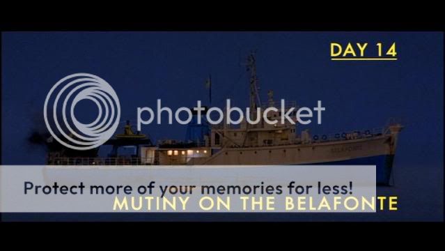
The look of the film is very rich and colourful, and the use of the onscreen writing for the change of locations, and the interesting use of a cross section of the boat (practical set) that the characters walk through, I thought were really cool and definitely made it stand out from anything else I've seen. It also has a really quirky soundtrack/score mixed with on film performances of Bowie covers in Portuguese....., yes that's right.


Anyway, I don't want to give too much away about the plot, but I would definitely recommend watching it. It's not only really funny, but it's definitely visually interesting and has a unique feel to it. I hoping to watch some more Anderson films soon, which I'm definitely looking forward to. 


Check out the trailer above guys! then go watch the film......


Monday, 21 November 2011

Address Is Approximate


Cool animated short by Tom Jenkins from The Theory films. Great combo of visuals and music (from The Cinematic Orchestra).

Friday, 11 November 2011

Taylor O'Brien : Portfolio Visit #1

So, the other week when I went into Taylor O'Brien to see how the children's book I had illustrated was going, and I also took my portfolio with me to show to Helen Taylor (the creative director), who had kindly spared a bit of time for me.

Helen definitely made me feel relaxed, so I wasn't as nervous as I thought I'd be about talking through my own work! As she went through the portfolio I just explained a little bit about the brief and what we had to do, and then why I chose to create the piece of work I did.

I kind of wondered what she was going to think about the work in my portfolio as it is a bit different to the images I did for the 'Christmas in Uganda' book. I always wonder if people can see the links between any of my pieces of work, never mind between my kids book work and the more graphic pieces I have in my portfolio, mostly because I find it hard to see myself sometimes (usually because I've made it differently and wonder if it has the same feel about it!).
But it was encouraging that she could see a link between my portfolio work and the kids books images, mainly through the use of colours and textures. She mentioned that they had the same feel about them, but the children's book images were just softer and more organic feeling. I think this was partly due to the fact that I didn't use computer generated geometric shapes like I often have, and chose to do all the kids books stuff with cut paper so it had a more hand-made feel. Definitely more time consuming though!

She seemed to like the work in my portfolio, particularly my 'lie detector' editorial piece, and was also interested in my newsletter/origami image. It just so happened that they had been working on a project with a similar idea of using birds to show transformation and flying off to something new, so that was quite cool.

I also took along a pieces of work that were in print (8x8, newsletter, album cover, wellspring paper) and showed these to her alongside the images in my portfolio. From what I've gathered it seems important to show your work in context (I've tried to do this actually in my portfolio through putting things in Indesign layouts, or through photographs) as it just gives them an example of how your images could work in the real world, as well as it looking quite good if you've had something in print. However on the flip side to that, it seems that people sometimes don't like seeing your work with type all over it, particularly if it hasn't been done by you or it's just plain bad. They seems to just want to see the images in those cases....which makes sense as the image is the only bit you're generally going to be doing.

The one piece I have type on in my portfolio is my 'James and the Giant Peach' book cover. This is because that was actually part of our job to sort out (and I hope it's not completely awful!). Helen commented on the interesting way I had designed the type for 'Roald Dahl', and also the fact that I'd made a feature out of his name rather than the title of the book. I mentioned that I thought that Roald Dahl was kind of the brand, and was the selling point and the thing you would first look out for in a shop.

We also talked about the fact that I'd made the cover so dark, and she mentioned that one way that could be remedied to make it more appealing to children would have been to just change the background colour. I think that was a really good suggestion which probably would have improved it, I think I was just too set on making it night time and trying to get the glowy effect from inside the peach!

Overall, it was a positive visit, and she didn't really have anything negative to say about my portfolio (unless I've conveniently blocked it from my memory), and it was definitely helpful to have someone reactions to your work as a whole. However, it's times like this I wish I had my business cards printed (even though I'd already been in contact with Helen and she knew my work through the children's book) but I still definitely need to get cards sorted for future meetings.

And finally, because the 'Christmas in Uganda' book was just about to go to print, I also had the chance to talk to Graham Bartle (the studio/production manager) about how he prepares things for print, and the different types of printing methods they used. This was really interesting as it's not something I know very much about.
He talked about sourcing different materials to print onto, and how they went through the layouts in Indesign. He also spoke about the differences between digital printing and offset litho printing, and the different cost and quality benefits from both depending on the volume to be printed.
I was able to look over a couple of examples of booklets printed in both ways, and there was definitely a bigger difference than I thought there would be. Some of the litho printed stuff I saw definitely seemed a nicer quality than the digital printed, but it often depends on which is most cost effective, with lithographic being better for large runs due to the cost and amount of paper used in just setting up to print.

All things to keep in mind for the future....... 


Friday, 4 November 2011

HUGS Book Update

So, over the past 3-4 weeks I've been working none stop to complete the children's book I have been designing and illustrating for the charity Helping Uganda Schools. The book is called 'Christmas in Uganda' and does exactly what it says on the tin! It tells the story of some animals in Uganda that learn about Christmas and the story behind it, and all profits from the sale of the book will be going to charity.
I was kindly invited in last Wednesday to see the designers involved with getting to book to print; TaylorO'brien. The book was going to print that day, and they talked me through any changes that had made, in the typesetting in particular (I'm thinking orphans and widows here!), and also learnt a bit about how projects are prepared for print and the different kind of print methods used. I definitely learnt a lot and appreciated the opportunity to go in and see how they worked!

I've posted a couple of preview pics of some of the artwork from the book below for you to see (there will be slight changes to the type on the final cover), and I'll post some more pics of the book in print when I get my hands on a copy!
Finally, and importantly, there is going to be a launch for the book on Wednesday 23rd November, at 7pm at the Britannia Hotel, Dialstone Lane in Stockport, so you are all invited to come down! The book will be on sale for £7 I believe, with all profits going to the charity, but even if you don't want to purchase a book, come down anyway and say hi! Would definitely appreciate the support! I'll post about it again closer to the time, but for now, take a butchers below, and spread the word!


Craig Oldham Talk

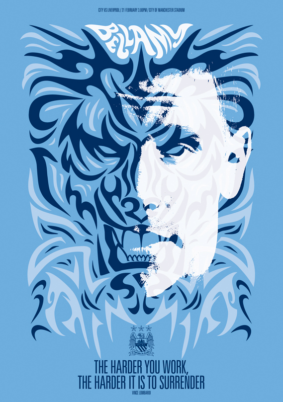
Yesterday, Craig Oldham a designer from Music design agency in Manchester, came into college to give the students a talk on his experiences working with illustrators entitled 'But isn't that your job?'. He took us through 6 collaborations with different illustrators, 4 of them for the same project, and 2 for separate projects. For the first 4 he spoke about the design of the posters posted below, as part of a campaign for Manchester City FC...

Michael Gillette

Chris White

Todd Slater

Shephard Fairey
The talk was really informative, as he spoke about how he finds the illustrators (sometimes just from a single book!), how the designers negotiate the money side of it, both directly with illustrators and with their representing agencies, and a little bit about how to approach people with your work. He also spoke about how they pitched for the different projects, and why they came up with certain ideas. 
It was interesting to hear about how they really think about what the client needs and not just what they want, for example, creating a whole typeface that can be used throughout a company for all printed material, rather than just a logo or a couple of finished items using the type.
 Overall I think I definitely learnt a lot about how the process works, and also that it's going to be very hard work!


We were all also set a brief to create a poster for the event, so I've posted my design below. It had to be two colour, and include all the necessary written information. I went for a kind of twisted, intertwined image of an illustrator and an art director to represent them working together. I was quite pleased with it given how quickly it was put together, although I can't say I was too happy with the type, wasn't the most imaginative! oh well....